For those of you that caught my post a couple of weeks ago about the Pantone Colors of the Year for 2016, you know that I was disappointed in the color(s). The Fall color palette was released at the beginning of last month with New York Fashion week and it was really a pleasant surprise. The most surprising thing is that the “color(s) of the year” are not included!
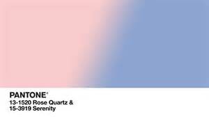
I have been following these color predictions for quite a few years now and while I have not gone back to fully research what I’m about to say, I don’t remember the “color of the year” being excluded in the past. It makes me wonder if this is somewhat of an admission on the part of Pantone that they’ve realized the error of their ways with the Pink Quartz and Serenity selections (aka ugly baby clothes colors from the past).
While the Fall palette itself is really pretty and useable, Pantone delivered a new disappointment: no downloadable report!!!! What the heck? I had to use a work around to get the webpages into a nice printable format for my study purposes — you know, because for some things, you need to have information on a page.
Be all that as it may, I’m going to keep quiet with my Pantone nerdiness and get into the heart of the matter: the actual color selections themselves. Without further ado, coming up for later this year, organized in terms of the colors of the spectrum, the palette includes:
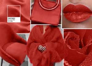
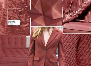
Red: Aurora Red and Dusty Cedar
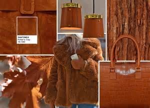
Orange: Potter’s Clay
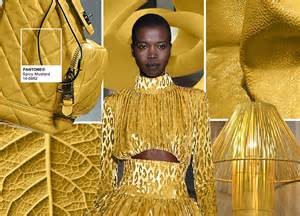
Yellow: Spicy Mustard
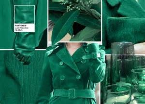
Green: Lush Meadow
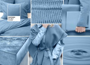
Blue: Airy Blue
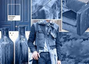
Indigo: Riverside
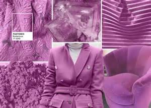
Violet: Bodacious
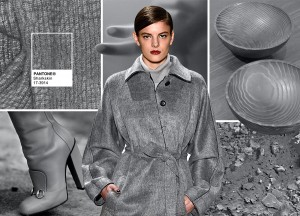
Neutral, Grey: Sharkskin
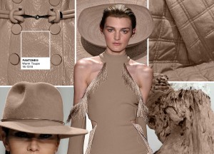
Neutral, Taupe: Warm Taupe
Maybe it is because I came of age in the 80’s when jewel tones were a big thing, but I find this palette stunning, really. There is a lot of grey underlying in these colors, giving them a gothic feel to me. But at the same time there is a vibrancy there — the colors are rich with just a little bit of a decay to them, perfectly mirroring the fall season. This is a sophisticated, grown up palette.
For those of us dyeing and prepping fiber, this will be an enjoyable range of colors to create and blend.
As for Pantone, what do they have to say about it? Interestingly, they say that this palette is actually led by the Blue family…maybe I’m too much of a bean counter but with two reds, an orange, a yellow and a very warm taupe…that feels warm to me and not cool (blue). They are still on the path of promoting colors that transcend gender — an approach that I really like.
Digging into the report and reading the blurb about each color, we finally discover what happened to Serenity and Rose Quartz! Airy Blue is a “nod” to Serenity and Dusty Cedar is a “nod” to Pink Quartz. Ok…I think this is as close to an admission of a mistake as we are going to get.
And, now, time for ideas on how I might incorporate these colors into my life:
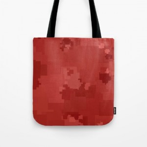
Aurora Red — Oh, lipstick for sure and probably a new purse…how about a beautiful length of woven textured yarns as a wrap?
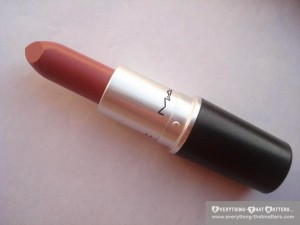
Dusty Cedar — Lipstick!!! Pretty much my good old favorite, “Twig” by MAC…I have to go with lipstick on this one because I think this color in apparel could easily look “old lady-ish”
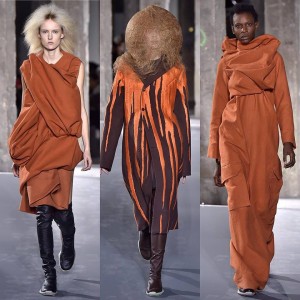
Potter’s Clay — This color will not be hard to duplicate with the naturals we have available to us (think fawn colored alpaca). Look how beautiful and rich looking this is as a “statement” piece:
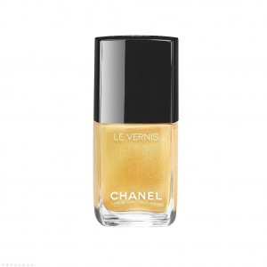
Spicy Mustard — I love yellows…but they tend to “control” so I find they have to be used sparingly. “Pops” of this color would be my direction. So, I will be adding in dashes of this color to add surprise and interest into my work. In the meantime, I think I’m going to go for a quick fix with this pretty nail polish from Chanel:
Lush Meadow — what a pretty, pretty green!! So, “technicolor”…Green leather gloves if I can find them…Also, I am thinking I’m going to like this with Bodacious — skip down below to see my pick.
Airy Blue — the “nod” to Serenity…gotta say I find this color as challenging as I find Serenity. I think the color looks dated so it’s not for me. I made a shawl from a yarn pretty close to this color a few years ago. It didn’t do anything for me. I ended up giving it away. So, I think I feel like, “been there, done that”.
Riverside — This is a new color from Pantone. It basically looks like a denim color to me and doesn’t really excite me. Maybe it’s a little too masculine for me.
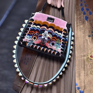
Bodacious — Now, we are talking. I see this color and automatically, I want to wear it. True it is a bit like Radiant Orchid (color of the year 2014), but a little more toned down. It would be fun to have a pair of glasses with frames this color. This will be very pretty with Sharkskin grey. I did find this cool bag from Fendi that I wanted to share with you which combines several of the season’s colors — this would translate well into a saori piece:
Sharkskin — Love, love, love. This is a great neutral for just about anything — shoes, hand knit garments, any type of accessory.
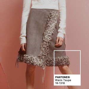
Warm Taupe — Another great choice and would be easy to recreate using natural undyed fibers. Will pair beautifully with Sharkskin. I recently bought a fantastic down sweater coat in this color and I simply love it. I also found this interesting skirt that would certainly be within the reach of many fiber artists:
…and, in addition to all of the above, I could see using all of these colors together in a weaving or in a knitted color work piece.
What do you think? Does these colors inspire you? In what directions would you take these ideas?
And, we have a giveaway winner for the 1 hour Skype session with Suzy Brown…Lesley B, congratulations! We will be in touch to get things set up for you. Thanks to everyone for their participation and support…Best, Arlene
Dear Ms. Lesley,
Good evening.
Congratulations and please tell us all about your experience spinning with Ms. Suzy Brown. What the fiber felt like, something new you may have learned and maybe a photo.
Have a wonderful time.
Thank you,
Miss Dahlia
Thanks for the update! I think this year’s. colors have some great fiber potential. (Think Potter’s Clay or Aurora Red with Spicy Mustard and Lush Meadow, or overdyeing some Sharkskin locks with those blues and the dusky red. ) Love that Fendi bag!
I love that bag too…very inspirational!
Great article, I follow the pantone releases too, it’s amazing how quickly the seasons come around. Many thanks too for the Skype session, I’m looking forward to it very much.
Thanks, Lesley!
What a fantastic piece!!!! You do so much to help us succeed. I’m just so proud to be part of this, and to be able to call you friends!
Thanks, Deborah!
I was JUST wondering about this yesterday and voila. So…thank you! As an 80s girl I kind of groaned as I started scrolling down through the colors…but I think I always have to warm up a bit to things. True confessions: when aqua paired with brown came out I did a face palm and wondered what whacko color-broker came up with that bomb…and the same with orange…and bright green…and…you get it. As a quilter I learned that yellow is risky. I loved the word you used: garish. I learned this when my baby quilt turned clown-suit. Now as I plan a yarn or a weaving I’ve learned to lay my colors out in an area I walk past. For several days as I “walk past” I will tinker, move, add, subtract…until I get my colors just right, just balanced. When I rush it and force myself to choose.right.now. I usually end up with something I don’t love… And sometimes when I weave I MAKE myself reach for the color I know I don’t like…and it has worked for me. I’m excited about most of these colors. And they others…they’ll grow on me. Hey – what doesn’t go with jeans, the perfect white tshirt and boots? Thank you!
Jennifer, I agree…sometimes these ideas take some getting used to. I love your idea about letting your palette “marinate” before you proceed. That approach is right up my alley. Your Welcome! Arlene
I love all the colors and could see me wearing most of them in some manner. Was never a big fan of grey until a few years ago, love the sharkskin! Thank you for your critique on this 🙂
Pingback: You Know It’s September When… – Fiberygoodness